Visual identity
Graphic elements
Brand elements
5 Circles brandmark
The 5 Circles are the five areas that make up a whole life: spiritual, family, business, financial and personal. They're interconnected because strength in one circle supports the others, and neglect in one is felt in all of them. It's why our companyt logo is built from five overlapping circles rather than a single mark, a literal representation of how connected they are.
The circles represent the 5 areas of modern life:
- Spiritual
- Family
- Business
- Financial
- Personal
Backgrounds
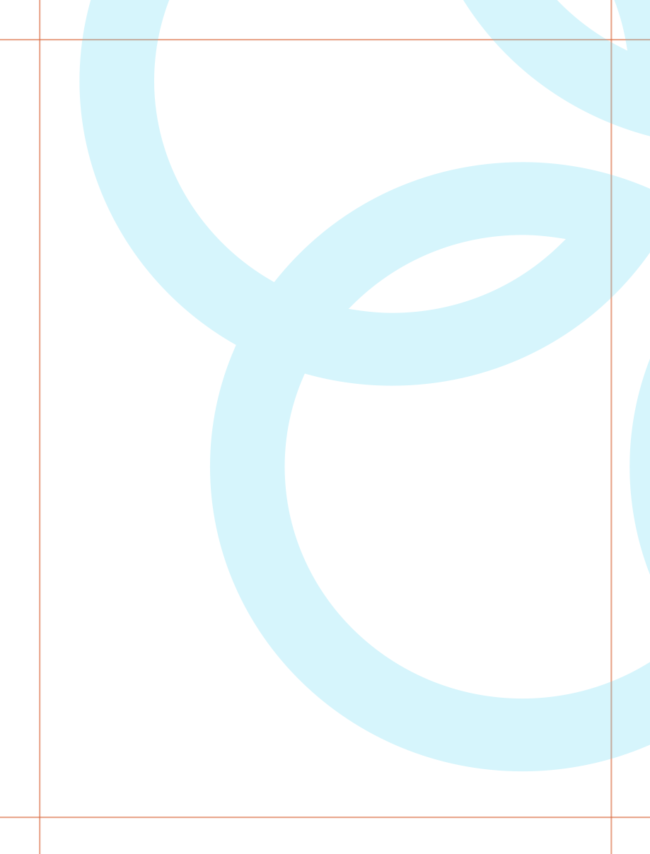
The Buffini logomark can be used as a background element to add structure and reinforce brand presence without distracting from the message. It should be scaled generously, reduced in opacity, and placed with intention so it supports the layout rather than competing with primary content. Use sparingly and avoid repetition to maintain a clean, controlled composition.
Clearspace

Use generous clearspace around the icon when using as a graphic symbol. The minimum clearspace is half the size of the logomark.
General guidelines
Use the logomark as a supporting element
The logomark can stand alone in specific contexts, but should not replace the full logo where clear brand identification is needed.
Use in space-constrained environments
Ideal for small-scale applications such as app icons, social avatars, or subtle brand accents.
Use with intention
The logo mark can be used as a subtle graphic element, or a decorative tool to create a dynamic branded look.
Symbol

The Buffini logomark can be used as a graphic symbol to reinforce the brand and add visual structure within a layout, or serve as a primary element.
App icon

Use a simple, flat icon with ample clear space to ensure consistency across iOS and Android. If the icon is updated, verify it meets the requirements of each platform.
Trail marker
The trail marker graphic element is inspired by the painted markers found on hiking trails that guide people along a safe, proven path. It represents Buffini's role as a Pioneer Coach, providing clear direction and helping Members stay on the path to the Good Life. The trail marker itself is expressed as a simple color bar or “rule.” Its simplicity allows it to integrate seamlessly into layouts while creating a consistent visual thread throughout the brand. The trail marker calls out the most important information in a design or layout. It is designed to draw the eye and reassure the viewer.

General guidelines
Let it lead, not decorate
The trail marker is a structural element, not a decorative accent. Use it with purpose to reinforce hierarchy, alignment, and the Pioneer Coach concept throughout the brand.
Create structure
Use the trail marker to organize content, establish hierarchy, or create visual rhythm. It should support the message by guiding the eye through the composition.
Build from the grid
The trail marker is built directly from the grid and should always align to it. Its width, height, and placement should be based on multiples of the base unit to maintain consistency across every layout.
Align to the layout
The trail marker should align with the established grid, margins, or key content areas. It should feel integrated into the layout rather than floating independently.
Align to the grid
Place icons within the layout grid to maintain structure and visual order.
Maintain proportion
Scale the trail marker proportionally with the layout. Larger formats may require a taller marker, but its proportions should always remain tied to the baseline grid.
Spacing from Content
Use the trail marker itself as the spacing unit. Maintain a minimum distance of one trail marker width between the marker and adjacent content. Increase spacing by adding additional trail marker widths to preserve consistent proportions throughout the layout.
Use approved colors
The trail marker may be set in Buffini Blue, approved tints of Buffini Blue, approved support colors, or their corresponding tints. Choose colors that provide sufficient contrast and feel balanced within the composition.

16px
16px line spacing
32px margin
32px margin
Figtree SemiBold
Figtree regular


Example:The green trail marker shown here is used as part of the video lower third. In this example, 32 px of spacing between the trail marker and copy provides comfortable breathing room. Spacing should scale with the format. Smaller applications may require less space, while larger formats, such as posters or environmental graphics, may require more. Always maintain enough space for the trail marker and copy to feel balanced and clearly separated.
Quote marks
Simple elements, such as quote marks, can be used to highlight client stories and bring attention to key moments without adding complexity. These elements should feel intentional and restrained, supporting the message and enhancing clarity while maintaining a cohesive and recognizable visual system.
General guidelines
Quote marks
Member stories are a core part of the Buffini brand. Quote marks can be used as a graphic element to help highlight authentic experiences and reinforce that these are real stories from real Members. Use the approved Buffini quote mark graphic whenever quotation marks appear as a graphic element. Do not use quotation marks from the brand typeface at large scale, as they are not designed to function effectively as a standalone graphic device.
Scaling
Use the cap height of the quote as the base unit for scaling quote marks, increasing the size in proportional multiples as needed. Crop quote marks off the edge of the artboard to create added visual interest and a stronger sense of scale.


I have a clear business plan and I know what I need to do to stay on track.
Debbie Smith, Member since 2024

I have a clear business plan and I know what I need to do to stay on track.
I have a clear business plan and I know what I need to do to stay on track.
Debbie SmithMember since 2024
Debbie SmithMember since 2024

Framed quoteQuotes may be isolated or placed within a frame or container to create emphasis or improve legibility over busy backgrounds.
Structural elements
Accent rule line
Accent rule lines are functional graphic elements used to organize content and reinforce the layout. They work naturally with the trail marker to create structure and strengthen the overall composition. Like the trail marker, accent rule lines follow the same 8pt baseline grid as the rest of the visual system, helping create consistent spacing, alignment, and hierarchy. Unlike the trail marker, these do not carry symbolic meaning and should be used only to support the composition.
General guidelines
- Build accent rule lines from the 8pt baseline grid and align them to the layout.
- Use to organize content, create hierarchy, and improve readability.
- Maintain consistent thickness and spacing throughout a layout.
- Align with margins, columns, and key content whenever possible.
- Use restraint. Accent rules lines should support the composition, not become a focal point.
- Use approved brand colors or neutral tones that provide appropriate contrast.
- Avoid using these accents as decorative elements or placing them without a clear purpose.
- Keep line lengths intentional and aligned to the grid rather than arbitrary.

Example:This flyer makes use of colored accent rules lines, some of which act as containers for copy.
Support elements
Icons
The Buffini icon system is designed to support clarity and simplify communication across the brand. Icons provide quick visual cues that help reinforce key ideas, guide navigation, and enhance usability without adding unnecessary complexity. The system should remain consistent in style, weight, and usage to ensure a cohesive and recognizable experience across all touchpoints.

General guidelines
Use icons to support clarity
Icons should reinforce meaning or aid navigation, not replace clear labeling.
Maintain consistent style
Use a consistent monostroke style across all icons. Stroke weight should always scale proportionally with the icon and should not be adjusted independently when resizing.
Design within a 24px square grid
Using a 1.5 px stroke, build each icon on the established 24px square grid, using the grid structure to guide its shape, proportions, and visual weight. For crisp rendering on screen, align one edge of the stroke to the pixel grid whenever possible. This helps maintain sharp, consistent icons across digital applications. Use 2px safe zone as seen in the example above.
Use of color
Icon color should be determined by function rather than preference. Use Neutral 90 or white for general interface elements, and Buffini Blue, dark blue, or approved support colors to create emphasis, establish categories, or reinforce hierarchy. Always maintain sufficient contrast and use color consistently throughout the layout.
Avoid overuse
Too many icons create noise and reduce their effectiveness. Use icons only when they help add clarity, not for decoration.
Expand the library
When a needed icon isn't available, create one using the established icon style. Once approved by the Brand Design Lead, it will be added to the official icon library for everyone to use.
Use consistently across touch points
The same icon should represent the same concept everywhere it appears.
Illustration
Graphic illustration is used to support key ideas, add clarity, and introduce moments of visual interest within the Buffini brand. Illustrations should feel simple, intentional, and aligned with the overall system, reinforcing the message without distracting from it. When used thoughtfully, they help communicate concepts quickly while maintaining a cohesive and professional visual language.
General guidelines
If it doesn’t make the message clearer, it doesn’t belong
Avoid adding infographics or illustrations unless it helps deliver the message.
Keep it simple and geometric
Use basic shapes and clean lines. Avoid complexity and unnecessary detail. Instead, make use of our expansive color palette.
Design for clarity first
Illustrations should explain or reinforce an idea quickly. Focus on one idea per graphic. Avoid layering too many concepts.
Use a consistent visual style
Maintain uniform stroke weight, corner radius, and proportions.
Align to the grid
Build illustrations with the same structure as the layout system.
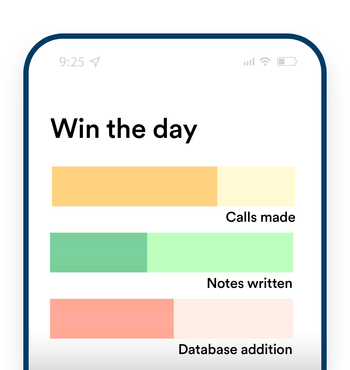
Illustration exampleAvoid people. Common objects such as phones are okay.
2023
2024
25
50
75
100
2025
2026